11.2 Graphical techniques
Written specifically for students to provide help and support for the IB Diploma chemistry programme this page provides full coverage of the syllabus content of Topic 11.2 Graphical techniques. It encourages you to think critically and provides many questions with full worked answers so that you can monitor and improve your knowledge and understanding.

 Learning outcomes
 After studying this topic you should be able to:
Understand:
- The effect of an independent variable on a dependent variable can be effectively communicated by graphing techniques, which can be used to determine physical quantities.
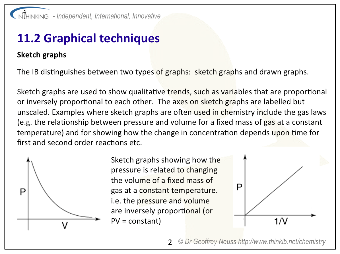
- Graphs that have labelled but unscaled axes are known as sketched graphs and are used to show qualitative trends, such as variables that are proportional or inversely proportional to each other..
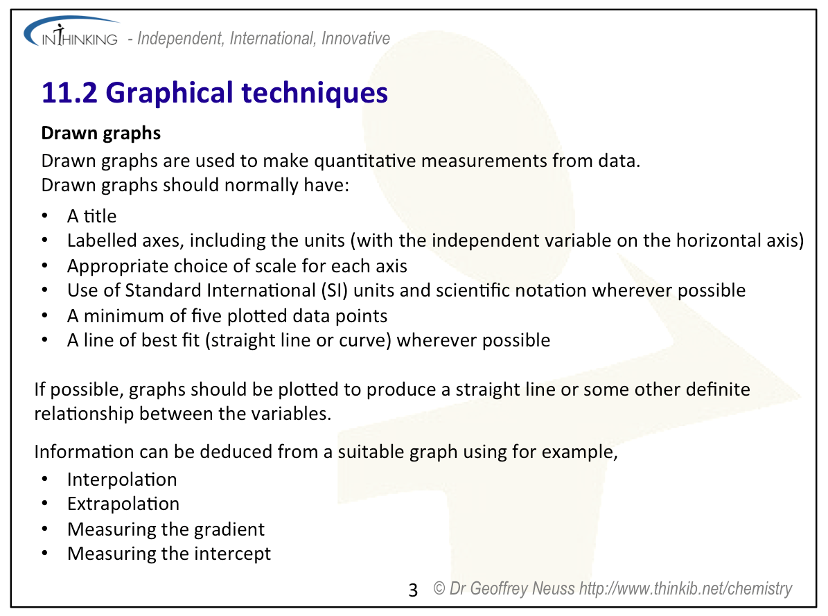
- Graphs that have have labelled and scaled axes, are known as drawn graphs and are used in quantitative measurements.
Apply your knowledge to:
- Draw graphs with the correct choice of axes and scale of experimental results.
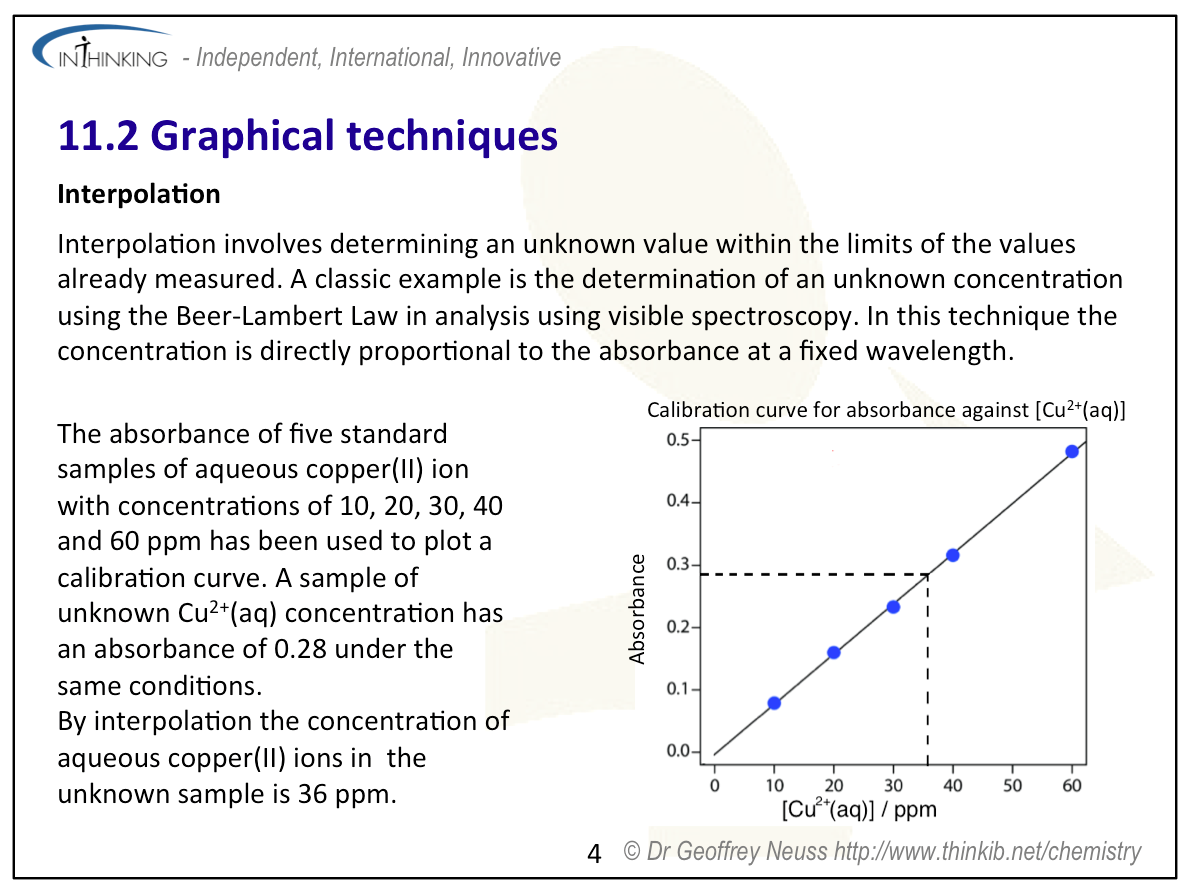
- Interpret graphs in terms of the relationships between dependent and independent variables.
- Produce and interpret lines or curves of best-fit through data points, including assessing when it can and cannot be considered as a linear function.
- Calculate quantities from graphs by measuring the gradient (slope) and/or intercept with the appropriate units.
Relationships & vocabulary
Nature of science
Graphs can be used to find connections between different variables - the idea of correlation.
International-mindedness
Because they are visual, charts and graphs mainly transcend language barriers so can facilitate communication between scientists worldwide.
For more examples and links to International mindedness, Theory of knowledge, utilization etc. see separate page which covers all of Topics 11 & 21 : Measurement, data processing and analysis.
Vocabulary
| sketch | draw | interpolation |
| extrapolation | gradient (slope) | tangent |
Learning slides
You can use this slide gallery for learning or for reviewing concepts and information. It covers all the key points in the syllabus for this sub-topic.
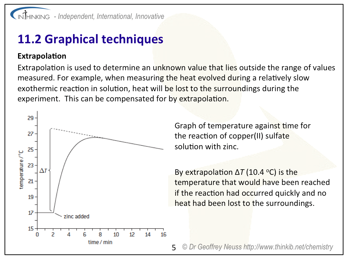
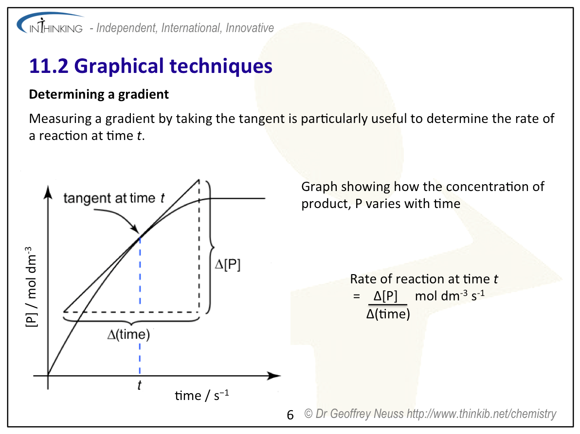
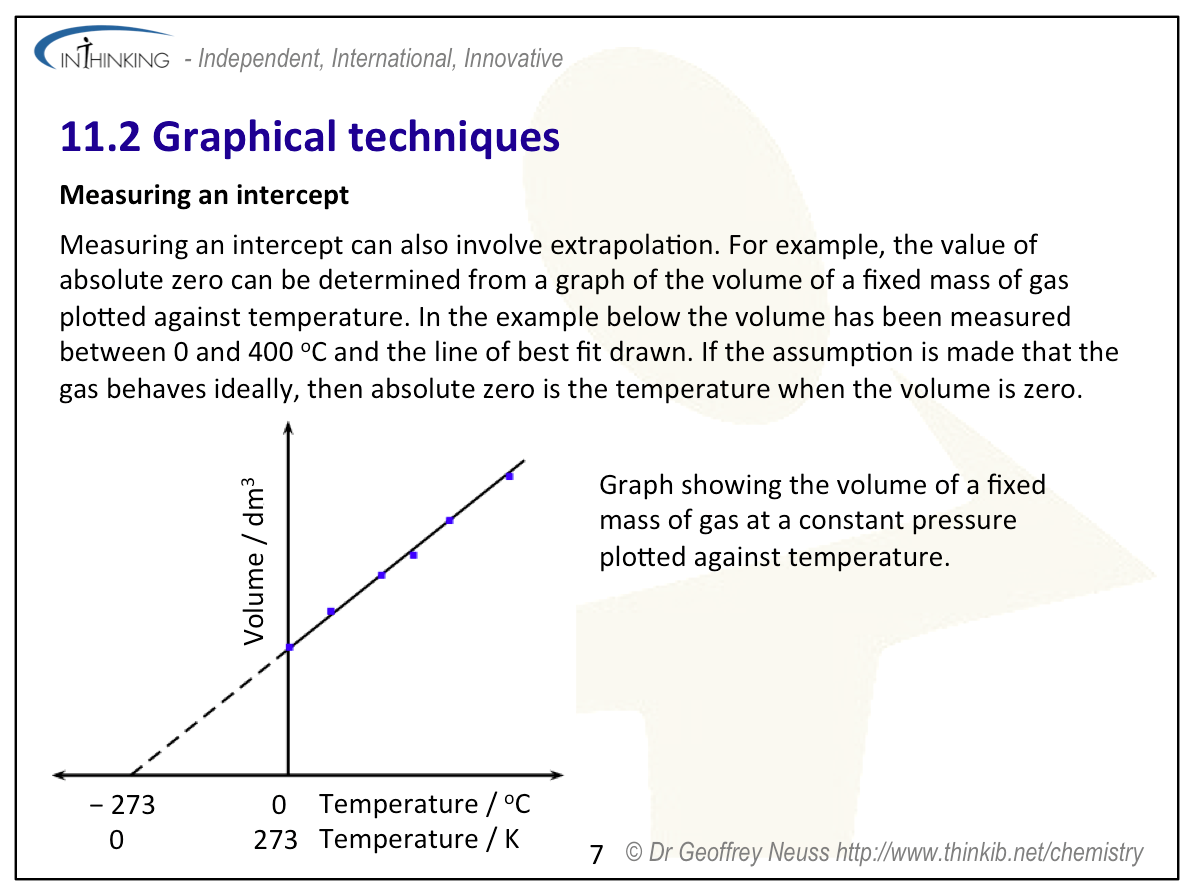
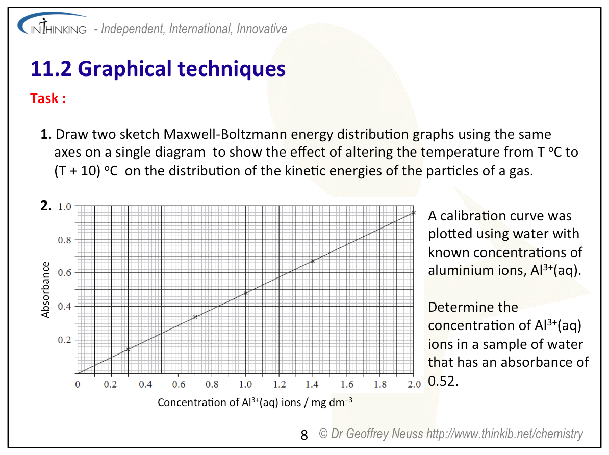
Graphical techniques:
Graphical techniques:
Graphical techniques:
Graphical techniques:
Graphical techniques:
Graphical techniques:
Graphical techniques:
Graphical techniques:
Graphical techniques:
Something to think about
During the past decades the IB has used the same graph several times as the basis of a question. The latest was in the specimen papers for the new programme. The graph used is:
It is an interesting graph because it shows how primary pollutants build up during the morning rush hour periods and then the secondary pollutants, PAN (peroxyacylnitrates), increase during sunlight hours as the nitrogen oxides undergo photochemical reactions with the hydrocarbons. Because this is very much the focus of the questions asked, attention is drawn away from the fact that if you draw such a graph when you are expressing your data graphically you would probably be penalized.
Firstly, is it a 'drawn' graph or a 'sketch' graph? It does not seem to fit either of the IB definitions so would seem to lie somewhere between the two. One of the axes does have a scaled axis (drawn graph) but the other does not have a scaled axis (sketch graph). Other problems include the fact that no units are given for the concentration - is the same unit of concentration being used for all four pollutants? No units are actually given for the time of day either although you are presumably meant to deduce that these are in hours. The title says' 'for a 24 hour period' but the exact date is not given - neither is the location of the city/town where the measurements were made. It could be that this was for an atypical day at an unusual location etc. etc. It might also be worth considering why NO and hydrocarbons build up during the morning rush hour but not during the evening rush hour - maybe nobody travelled back home that day?.
Graphing is a powerful tool but it is also a tool that can be used to manipulate interpretation. You only have to look in the financial press to see how graphs are often misused. For example, the press reported that Facebook shares plummetted after an announcement by the Chief Financial Officer, David Wehner in October 2014. A superficial look at the graph might lead you to conclude that the value of the company had almost been wiped out but on closer inspection of the y axis it can be seen that the company only lost about 9% of its value - hardly a 'plummet'.
Test your understanding of this topic
(Note that your teacher may have restricted your access to some or all of these questions and worked answers if they are going to use them as a class test or set them as an assignment.)
For ten 'quiz' multiple choice questions with the answers explained see MC test: Graphical techniques.
For short-answer questions see Graphical techniques questions.
More resources
1. A video on interpreting scientific graphs by Jaime Jackson
Interpreting data - Analyzing graphs
2. If you are interested in how graphs can be used to manipulate data to give the wrong impression it is worth looking at an article by Ryan McCready on Five ways writers use misleading graphs to manipulate you.